Photo Grid

Photo Grid

Sunday, November 28, 2010

Artist Inspiration: Tomoko Sawada

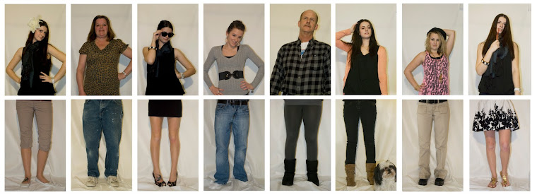
Tomoko Sawada is a Japanese artist that I found from my art history class, history of contemporary photography. I really liked her work. I felt like it was similar to Nikki S. Lee's that I had mentioned before. She dresses up in costume to conceal her identity in order to show the ability of identity to change. One of her most known works, Teenage Girls, she dresses herself up and photographs herself as multiple girls. 


It's amazing because in the photos, it is very hard to tell that it is her throughout the photo. She also does many group shots (school photos), where she depicts herself as a class full of students, including the teacher.

Many Facets
I am going to continue to look to her work to help me with my own work. I enjoy what she is doing because I feel like she executes her idea well. It makes the experience of looking at her work more enjoyable. Upon realizing that each figure is the same person, a certain fun is felt because it is just then that we realize we've been tricked.
Take a look for yourself...we've been tricked! 

Introspection
For my last photo project, I decided to work with something that I had not done yet...self-portraits. For this series, I chose to explore the topic of introspection, which is the study of one's own emotions, thought processes etc. Throughout the series, I wanted to maintain a natural feel. I didn't want the photos to feel posed. Through my facial expressions and body language, I projected my inner thoughts and feelings, conveying a sense of happiness mixed with a small amount of dissatisfaction. I found it pretty useful because I want to do self-portraits for thesis. Doing this project, gave me the opportunity to practice with focus, while remaining my own subject. Can I say... I feel a little accomplished doing this project because I've never been the subject of my own photography...or anyone else's for that matter. I was a little embarrassed to show the project at first because it felt very personal and I felt like I was inviting my class into my inner thoughts but after showing the first few photos, I felt so much better. It made me feel better about myself and more comfortable with myself. Who knows...maybe there will be some nudes in the near future? hahaha...not likely :) 

Wednesday, November 17, 2010

Inspiration

I've been doing a bit of thinking about my thesis and I'm starting to get some great ideas. The topic I want to explore is that of identity. I find it very interesting and it is still an aspect of my main focus, psychology. An artist that I've been admiring is Nikki S. Lee, a Korean-born photographer. When working with identity, she created a series of projects in which she immersed herself in different cultural groups such as Punks, Exotic Dancers, Hispanics, etc. In each project, she dressed up to play the part and became friends with people belonging to that cultural group. I admire her conceptual ideas because she took the work further by playing the role of individuals of the group. In the majority of her projects, she is almost unrecognizable. 
Nikki S. Lee


Nikki S. Lee
The Hip Hop Project


Nikki S. Lee 
The Hispanic Project


Nikki S. Lee
The Senior Project 


Nikki S. Lee
The Yuppie Project


I look forward to keep on exploring Nikki S. Lee's work and hope that it will further inspire me to work further toward my thesis idea. 

Monday, October 18, 2010

Journal Part 1

So, right now I'm working on a project in which in working with portraits. Above is my setup that I created at home to get the light setting that I wanted. The scenes that I create are mostly done in my house with a tripod, which can also be seen to the left. The idea behind the project is to have the same model but show her with different facial expressions and in different poses to convey a specific idea such as happiness, depression, etc. I also plan to pair each portrait with a different still life which will create a relationship between the two. Examples of the still lives are such things as tools, a set of prescription pills, and a bag of women's make up. By doing this, I want to express the idea of how we look at others and formulate a sort of judgment based on the available information presented to us about them. We do this through seeing the individual in the clothing they wear or in the accessories they possess such as a purse, skateboard, etc. The still lives will act as a catalyst to the formation of a persona on the viewer's part. So far, I've shot multiple portraits in different positions so I have a lot to work with. I'm very hopeful with the project and am looking forward to the results. I could say that this project definitely relates to thesis because it is helping me figure out which realm of psychology I wish to investigate for my thesis project.  

Sunday, September 19, 2010

WlcmBck Show

One thing I first wanted to mention was the play of words used in the title of the show. The elimination of the vowels, I thought, was very interesting because it was out of the ordinary but yet still understandable. It's interesting to see how the brain is still able to maintain continuity when understanding language even if parts of it are missing. 
When looking in the gallery, there was a room which paid homage to a Mason Gross alum named Lyda Craig. Of all the rooms this one was my favorite. The room carried a unified style. I felt like I was able to get a sense of who she was as an artist and was able to understand her. She had numerous self portraits which gives the idea that she has a strong psychological sense of self. She is very aware of her personality and who she is as an individual. They also appear to be very dream-like based on the bold colors she uses as well as the loosely painted lines. She appears as a modified version of herself and in some pieces is slightly fantastical. 

One of her many pieces is one labeled Untitled (figures in interior space), 1999, mixed media. There are a few other pieces with the same style as this that are also scattered among Criag's other pieces. This piece, like the others that are similar have a limiting color palette that is confined to neutral colors. This choice of color adds a very simplistic style to the work itself. She uses black, white and a lighter brown which are used to render figures and also create a sense of space. In the left-hand side of the piece, There are two figures that have their bodies turned and appear to be looking out into the distance towards the center of the canvas. The coloring between the two suggests that there is a great difference between the two, possibly something like the idea of "good and evil." The articulation of the white figure also suggests that the figure may be female. Although it is hard to tell, it seems as if this figure has long hair while the other appears to have a hair style that is dramatically shorter, suggestive of a male. These figures are also rendered much differently than the others. The two are given subtle shadowing to suggest that they are three dimensional forms while the others appear to be ghost-like silhouettes. There is also a shadow placed under the two that further suggests their three-dimensionality. Even though there is no horizon line, the shadow suggests that there is a solid form that the figures are standing on. Like the figures. the space that is created also offers a sense of polar opposites. The fully articulated figures are presented against a white background whereas the silhouettes are set against a black one. In the black portion of the piece, there are four figures, possibly a fifth that appear in different positions. There is one, the brown, that appears in motion. This one is particularly interesting because it is a cut out that has come from a rectangle that appears to the right. There is also another figure that is lying on the ground that may suggest agony or death. These figures do not appear to be aware of one another because there is no interaction or sense of acknowledgment. The figure on the floor is left unattended and isolated from the others. Even though there are a few figures grouped together, they create a sense of disconnect. 
The piece itself appears to have a psychological connotation. It appears that maybe the darker portion of the piece is meant to represent the inner psyche of the individual, Lyda Craig, and show the conflict between her various consciences or personalities. This series of this type of work also works with her others to convey a sense of psychological self that permeates throughout her work. I feel like this work appears more secluded from the other works because this collection has the same type of style but does not disconnect it from the rest of the show. In other locations of the gallery, it is apparent that the works were submitted by multiple artists rather than just one. I don't think there is anything wrong with the way this room was set up because it is meant to pay tribute to Lyda Craig as an artist. It is not entirely segregated from the rest of the gallery because like the others, it is multi-faceted in the sense that she employs mixed media and uses a variety of colors and mediums throughout her various works. 


In the main room of the gallery, there is a large piece that hangs on the far wall. It is a rectangular piece that is hung differently from the others. It is set higher and therefore grabs the viewer's attention. The piece is by Raphael Montanez Ortiz. It is titled The Dark Side of Liberty and is a computer generated painting. The piece depicts the Statue of Liberty as its focal point and center of attention. The Statue commands the attention of the viewer and also places emphasis on the value of liberty. The Statue is set against a dark background which is meant to give off a negative connotation. At the foot of the Statue there are protestors in possession of banners that are against immigration laws. There is also a body of water in the foreground in which there is a number of Mexican men clinging to a floating object. Here he is making a harsh gesture towards the idea of illegal immigrants coming into the country. For the most part, the message is very straight forward. Based on this message, I think that Ortiz is trying to show that in his mind, liberty was once a cherished thing that meant opportunity for people and a light of hope in life but since feels that people (immigrants) are taking advantage of that. In his opinion it is very wrong and tarnishes the image of liberty. The scene is accompanied by a reasonably sized group of text that further exclaims the damage that immigrant invasion has done to the country and especially to liberty. This idea is firmly backed up by a set of tornadoes that are placed in the background. These elude to the idea that the invasion of illegal immigrants has caused devastation and havoc to the United States just like a tornado does by nature. 
It is a very alarming piece that I felt set itself apart from other pieces in the gallery. Because of its bold gestures, my focus kept being directed towards this piece. I felt it was very extreme but yet I give Ortiz credit for taking a touchy subject and offering it to viewers in a very provocative and confrontational manner. Since it is very confrontational, I feel like it segregates itself from the rest of the pieces because it makes the viewer uncomfortable. Although I feel like this may have also been one of the goals of the piece, I feel like it also imposes itself negatively upon the other pieces. I could see this gallery show without this work. Even though this show was not meant to carry a specific theme, I felt that the rest of the works were visually more light-hearted. I applaud the curators for working with the piece because I felt that they worked with it as much as they could. The other pieces that surround it in the room seem to reference other cultural issues that deal with the environment and the media as well. That being said, it introduces us to the next piece entitled Syn by Patrick Strzelec. 
Syn is made from cast aluminum, limestone and stainless steel. It is a sculpture that appears mostly abstract. It sits in the center of the main gallery room atop a cubed pedestal. The placement of the sculpture on the pedestal makes it more available to the viewer. It is not small so a viewer would not easily walk past it. This also creates more interaction between the viewer and the artwork because it is placed around midpoint level with the torso. The shapes it creates references the shape of a nail that appears to have been melting. The forms are fused to one another at many different locations to create an aerodynamic setup with the ability to stand still on a pedestal. 
The most interesting part of the piece is the color that is used. The green transforms a visually stunning piece into something that is extremely eye-catching. The green seems to me that it references the environment. The term "going green" has become a popular idea in culture today. A vibrant green, like this, is used to represent our Earth as well as deliver the idea of creating a more healthy planet. The interesting part of this color being paired with these forms is that they are two totally different things. The forms look like nails which are man-made and derived from materials that are also man-made. The green may represent the organic aspect of the world such as the foliage, plants and overall environment. The materials that are used to make the piece are also an interesting combination because it consists of stainless steel and cast aluminum which are man-made but also utilizes limestone as well, a material found in nature. These combinations of materials are interesting and appear to be planned. The overall message meant to be taken back from the piece is that nature and man coincide with one another and will continue to do so. Regardless of the many acts of "going green" in today's society, nature will always be confronted with industrial, man-made forms.  
Syn works well with the other pieces that are shown in the main room because it utilizes color like most of the other works do. That, in a sense ties them together. The message is also another factor that ties together the work. Like The Dark Side of Liberty, the piece seems to connote a sense of cultural awareness and an investment in cultural issues. The location of Syn works well with the rest of the show because it is exhibited in the center of the room and given enough space in order for the viewers to fully walk around the piece. It would not have worked well placed in another room because the rooms would have been too tightly packed and the sculpture would not have been able to be experienced to its full potential. It also works with the other pieces because it is very contemporary and also abstract. 
The final piece in the show that I will be talking about is a piece entitled Reynolds Girls by Kate Pollard. This piece is a smaller photograph that depicts an older woman who is flanked by two apparently younger women, possibly family. The two on either side appear to be comforting the older woman. Their heads are bowed with their arms around her. They appear to act as a stabilizer for the older woman. The older woman's body language suggest that she is in a fragile state. She seems to be leaning on the brunette for support. Another support of her being frail is the white band that appears on her wrist. It looks to be a hospital bracelet which notes that she is not only emotionally frail but may also be physically fragile as well. The setting appears to be mundane. It is as if the women were sitting in a kitchen but were suddenly overcome with emotion. It is possible that something dramatic has happened to the older woman or someone that she knows. The act of writing on the calendar and the cook books sitting on the right of the frame further suggest the mundane attitude of the scene.  
The piece itself is very intimate. It seems as if it is a moment that we as viewers are not allowed to see unless we were someone close to older woman. It is  different from the other pieces in the gallery because they are more abstract in form and idea. This piece on the other hand, acts as a captured moment or representation of time which makes it different and easily separate from the others. It works with the others in the sense that this is a show in which there is not a theme  and is meant to show the collaboration of different types of artists (sculptors, painters, photographers, printmakers, etc.). Generally speaking, I feel that this piece would be more fitting in a different show.   

Friday, September 17, 2010

Interview with Travis Part II

So I though that just the interview wouldn't do his work justice so I chose to show some of Travis's work. When looking at the work, take into consideration the statements he had said about himself as an artist. Enjoy!

This was the piece he had done in a friend's basement that is constructed with found materials. 


This was the tree from his sketchbook that was meant to note a segmented tree. 

Thursday, September 16, 2010

Peer Interview with Travis Johnson

This is an interview with Travis Johnson who is currently pursuing a B.F.A. with a concentration in printmaking. 

Danielle: Can I ask, what kind of materials do you work with in your medium?
Travis: To tell you the truth I use a lot of found materials, paints that I find etc. 

He spoke about how he painted a friend's basement with one large mural that varied in subject matter but was very interesting and colorful. He explained that everything he used was a found material. It consisted of things he had found that were already in the house. I thought this was interesting because it references the readymade. The way he works is also limiting to himself as an artist because he is forced to make art with limited resources but has the ability to adapt. I think he said that the mural he made took him 2 months to construct and cost him only a dollar and change. I was amazed.  
While looking at his sketchbooks, I felt privileged because I felt like I was able to see an aspect of his inner artist that I feel like a lot of people might not have the opportunity to experience. The sketchbook contained a number of drawings as well as text, which was interesting. The pictures were of numerous subjects such as people and animals as well as designs. My favorite sketch was of a tree. It filled the page and was oriented vertically. Segments of it were covered by Post-its which, when uncovered revealed a blank page. When I asked about his thought process on this sketch, he told me that he was on Douglass campus and saw fragments of a tree that had been chopped down. This sketch was meant to represent the tree as he saw it in pieces. I thought it was extremely interesting and thought that it was very strong conceptually. This was when I saw that he had a very interesting thought process and would see more interesting works to come. The text that was included in the book, for the most part, did not correspond with the drawings. The text served more of a documentation process, which may be useful in his work. 

D: Do you have any specific interests that you'd like to pursue? Possibly a certain interest towards the environment? (This came from things I had seen in his sketch book) 
T: Not really. I wish I did. I always wish I had taken strong interest in anything, have a cause, like a cause you're willing to die for…something you're really passionate about. I haven't found them. I've tried them. I've tried the environmental thing, tried to support the war in Iraq (support the troops). I've tried a lot of angles but my heart just isn't in it. So, I've been rolling around in life taking pictures and writing notes about things that make me think…I really have an aversion to electronics. I use my laptop and listen to music all the time, but I wish I didn't. It's like everyone is hooked into texting and ignoring everything that is going on around them. So I really would love to do things that would distract them from that
D: Like something more organic?
T: Not really. I like looking at things that make me turn my head sideways and think "hmm." I'd like to be able to make other people do the same thing, to make them think for a moment, even if its completely stupid. Like drawing a smiley face upside down or something. It makes you think for a second. 
D: Maybe you could look at something like how technology affects nature. Like thinking about how we take things in nature for granted because we have technology.
T: Yeah, the other day I walked onto the bus and saw that everyone was wearing headphones, sitting alone totally disconnected from one another. I just want people to realize and turn their heads sideways and see that other people are doing the same. It want to get people talking. 
D: I think that would definitely be something to go for when you think about thesis. Have you had any ideas for it?
T: No, not yet. I feel like I have to involve printmaking somehow so I figure I'll make a mural and include a bunch of prints in the middle of it; have it be a mixed media mural. Then I would like to create some sort of environment in a corner. Like have sound playing and have you walk into the environment so you're no longer in a gallery but are surrounded by something else. 
D: Did you want to separate the two? Have the mural and the environment not be in the same room?
T: No, no. I'd like to create an environment so it would be about everything you see, everything you hear. Usually when you're standing in a gallery everything is sterile and white. 

After this statement, I suggested that he could incorporate the ceiling and floor in working towards creating an environment in the gallery. He generally like the idea and thought it was interesting because it is not something that one would normally see. 

We looked at another sketch book. The questions begin with asking about the content of that book. 

D: I feel like this is a lot like your other book. Is this one any different?
T: They're similar. I bring this where I go. These are my thoughts and what I see. This is what I use when I don't have a camera. ill draw something out that i see. it keeps me out of trouble. A lot of things I do are mainly just recording things that happen around me. There are nonsensical things that come from dreams. What I like about drawing is that you can use whatever is lying around
D: (In reference to a drawing) What is this?
T: These all started turned into a printmaking final I did called Possibles, Not Probables. Where there were a couple sentences long of stories of things that could happen, but probably would not happen. 
D: Did you use pictures in these prints? 
T: Not for all of them. 
D: Do you work a lot with text? Because I feel like you have a lot of text in here. 
T: This is also a book that I took to Europe. Since I didn't have a camera so I used this to write out dialogue…I just tried to write everything down. 
D: How do you feel about illustration?
T: I don't know. I mean, if you look through here the styles aren't consistent. 
D: So do you have any kind of influences at all like any artists that wow you or make you want to do work like them?
T: Absolutely. There this guy named David Cho. I'v meet him on several occasions. I admire artists who use what they have to create. 

I enjoyed looking at Travis's work. I, unfortunately was not able to go to his studio because he doesn't have one but I think his sketch books definitely took the place of that. He did at one point try to have a silkscreen lab in his basement but was unable to maintain it. To me, Travis doesn't appear to be an artist that necessarily needs to be in a studio to create work. It seems like he works by experience, which is evident in  his sketchbooks and his trip to Europe. I really think that works for him because I believe he discovers his creativity through walking around rather than keeping himself to a confined space. I think it makes his artistic process unique and interesting. As for his style, I feel like he is still trying to develop what makes him an artistic individual. He appears to have different interests in different mediums such as both painting and printmaking. He's also interesting in silk screening. He uses a great deal of lines in his work which is very interesting. The subject matter, although it is not too uniform, carries whimsical, dream-like characteristics (some of the figures being fictional or totally made up). It is apparent that he does not work photo realistically, but more like graphics.

  I am looking forward to seeing what he comes up with for thesis.