Upon arriving to the gallery to see YOU ARE HERE I AM, I was able to pick up a map that plotted where all of the pieces in the show were located around the gallery. The idea of the map was very unique, as it was something that I had not seen before in a gallery show. To me it referenced a mall directory, which became apparent through the part of the title, YOU ARE HERE, which I do not feel is a bad thing. This concept as a whole, I believe to be more interactive between the viewer and the artwork itself. The viewer must look at the map in order to know the ID information on a specific piece of art. I feel that employing this technique would be helpful to the artist because a viewer may be more inclined to locate it on a map in which the her or she is in possession of as opposed to walking up to a wall in which the wall text's relation to the artwork it belongs may be ambiguous.
 In general, I felt that the overall layout of the show was very well-balanced. Although the main room of the gallery is primarily used to house sculpture and installations in many shows, it did not become overwhelmed by such work. I was glad to see the merge of photography, painting and installations within a room. This installation, A Terrible Realization, is one of two installations by Max Cemeno that were centrally placed within the first main room of the gallery. I felt that they were the extremely important to the show because they were the first that the viewer would see when walking into the show. Being that they were very attention-grabbing, fellow art-lovers were drawn in. The pieces are also striking in their concept as well, which to me, expresses both social and political opinions. They cause for the viewer to mindfully engage with the work and formulate a sort of mental debate between their own thoughts and that which is expressed by the artwork.
  |
| Jason Carrey_Sheppard |
 |
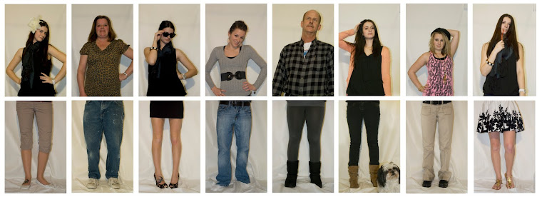
| Travis Coatney, Untitled |
Overall, I would have to say that the show was well-balanced as far as color and content, which gave each piece an equal opportunity to shine. There was not one piece that overpowered another within a room, which I feel is important when planning and curating a collaborative show. I also enjoyed how there was not one room that could have been deemed a "sculpture room" or "photography room," which I felt diminished a sense of artistic hierarchy that is sometimes present within shows. The show itself effectively displayed the collaboration of artists and the intertwining of various mediums. Navigation was clear and orderly. Well done grad students!


No comments:
Post a Comment